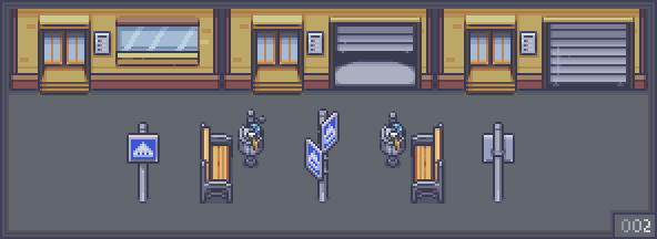
2nd update: Big City Life 2/?
update v1.2
"Big City Life" is the first update serie, with the aim to enhance and add variety to the general look of the asset
Every 5-10 updates I'll add a new mockup .gif
-
- Added a condo intercom and a new window option
- Added a closed shutter and its open version (still not animated)
- Added a side-view park bench and a filled bin
- Added a crosswalk sign, its side-view version and its back-view version
*Everyone who already bought the asset can get the new stuff for free
See you and happy game-making! :)
Files
Modern_Exteriors_v1.2.zip 5.8 MB
Dec 28, 2021
Get Modern Exteriors - RPG Tileset [16X16]
Modern Exteriors - RPG Tileset [16X16]
16x16 tilesets for your top-down game
More posts
- 394th update: Additional Houses 4/?26 days ago
- 393th update: Additional Houses 3/?35 days ago
- 392th update: Additional Houses 2/?43 days ago
- 391th update: Additional Houses 1/?50 days ago
- 390th update: Military Base 29/2964 days ago
- 389th update: Military Base 28/?72 days ago
- 388th update: Military Base 27/?78 days ago
- 387th update: Military Base 26/?84 days ago
- 386th update: Military Base 25/?88 days ago
![Modern Exteriors - RPG Tileset [16X16]](https://img.itch.zone/aW1nLzc3MzExOTcucG5n/original/%2BWEZUw.png)
Comments
Log in with itch.io to leave a comment.
Why do I smell textfiles from those shutters?
Your details are so good! This will be one of the most detailed exterior packs ever!
Amazing as always, Real nice touches that I can add straight away to my game. Thankyou LimeZu <3
You are welcome Ghost, can't wait to check your game! <3
Maybe somebody could use the new condos with shutters to represent open and closed shops
That's a great idea Volcano!
I kind of meant it as a shop entrance(like you see in malls with the gates open or closed(see linked images)) or maybe like a display window of a shop.

I don't think I've seen another city tileset to include something as simple as crosswark sign. You already beat them all :D
ahahahaha it's easy to beat them all since there are not many city assets out there! At the moment I feel a bit overwhelmed by all the stuff I need to add, so I'm going step by step being conscious that some aspects of the city are still absent!
Yeah, I'm trying to hold any suggestions for now, first to let you cover the stuff you feel is the most important.
I'd say japanese assets from GuttyKreum are very good and robust, but those are made in too much detail for my 16x16 pixel world XD He has modern city called Clean City, but it doesn't mesh that great with your artstyle and doesn't have goodies like door animations that you put in your project. There was one more good 16x16 city I found, but I can't recall the name now... Anyway, they were both not exactly what I was looking for, but your city asset is slowly becoming exactly that :D
GuttyKreum city asset is great no doubt, but it surely lack animations! One of the aims of this asset is to have an animation for every object that could have one (let's see how it goes ehehe)
I agree. He also obviously prefers 32 and 48 pixel sizes, with them one can create big varied world. The city is his only 16 pixel asset, and it doesn't always mesh with other similar things. That said it's what I was using as placeholder while waiting for your Modern Exteriors.
It's the little things like the condo intercoms that do it for me. Things we as gamedevs would otherwise forget. Incredible.
Totally agree!
Thanks guys, I appreciate a lot your attention! <3
I like the idea to add a number for every update image! Further more, I noticed you edit/add info on the main page after some questions. It is nice to see you get better and better with art and other parts of your job! :)
Thanks Aidas, last year taught me a lot and I'm trying to learn from some mistakes ehehe