Hey man! Working hard on updates, as I'm working hard on edits, lol. Have you already made a character with twintails or have I missed it somewhere in the humongous size of this pack?
ahahah no there's no twintails character yet! I'm shifting all the character requests a bit cause I plan to introduce a system to create any characters by summing the various png having one body part/trait each
Great to see a consistent stream of updates here. I've used this pack before and now used it again for another game jam game, Haunted Rooms. It's worked well for me and I would recommend it.
I'm not sure this asset is suitable for autotile function. That function is mostly used when walls are made from a single part. In this style wall is made from 2 tiles. There might be a way to do it but I would just do it by hand
These assets are amazing thank you for the great work! I am using these for a therapeutic game for children, mostly from impacted communities. It would be great to have more character sprites representing a wider range of ethnic minorities and backgrounds, so our kids can feel more represented :)
Hi, that sounds like an amazing project! For the kid characters, would it be ok for them to only have the idle and run animations for your purpose? That way I could draw way more of them!
That would be awesome! We actually only use the idle and run animations so that works out perfectly. Thank you so much for your work, it's having a really big impact on these communities. In case you want to check out the project: https://www.therapysandtray.com/
Ok, I wasn't expecting such a cool and perfectly working application...I'm blown away by the idea. I'm really intrigued by it! If you need any specific items you would like to have, please write a list and I'll try to add them as soon as possible!
You've got a bug with new characters, rainbow shirt person and spiky head person are flipped. If you put them on the map they'll appear as themselves, but when you drag them anywhere they'll transform into other one. It's pretty funny :P
Instead of having one Room_Builder_16x16.png that contains a lot of different things, splitting it up into a number of smaller files would be much easier to work with as a developer, especially when there are frequent updates.
So you could have a Room_Builder folder and that could contain:
Great idea! This would be helpful not only for updating the assets but also creating smaller tile palettes. I did a separate file only with shadows and it was much easier to work with
Agreed, when I update room builder in unity it takes it 30 minutes to process the file.
Also, having it split into different files will mean that there's no need to reorder stuff around when new type of things or new row of things gets added, so it's more future proof. I already had to redraw my walls when new wall types got added and shadows moved.
And if someone really wants whey can make single palette for room builder things... in Unity they can anyway.
As a side note: would be great to not move the tiles around in the tilesheet if possible, it makes updating them easier :D
Thanks for your precious feedback guys, I've just updated the asset adding a subfile for each section of the "Room_Builder", as you asked! Also, I'll pay attention not moving around the stuff that's already placed! ;)
This is fantastic, I'm looking for an asset for my gather.town space, which is meant to be a lockdown substitute for the house parties that I threw in happier times, and preliminarily I'm thinking that this is gonna be the asset pack that we go with, but either way it's so phenomenal I just had to have it, and wanted to leave some appreciation for the talent and dedication of the artist! 😍
Gosh, I wish that gather.town had support for animated sprites...
I absolutely love the pack. I also like the color palatte.
Just a random question. Does anyone know how you implement this on Godot? At the moment I'm considering placing individually but that seems inefficient
Absolutely awesome pack! Just seeing these assets made me shift from what I was doing to these graphics. I happily bought them! Plan to be making a school game~~ let's see how it turns out!
One thing that I did for myself, that I thought would be cool "official" addition. I've separated the shadows dropped by the walls into separate 4 tiles, that have a bit of alpha transparency for shadow part, and are otherwise transparent. Now I can draw all my rooms with using only 1 tile for the floors when prototyping and it makes it easy to update them, and when I'm done I just add the shadows on the separate layer as needed.
With this approach I can even have walls drop shadow on some items where it makes sense, for example I can have shadow over this carpet.
You could add it to room builder above all the floors. I've seen that done in some other tileset and it's really cool! And if I now want to replace all the floors in a room I can just use fill tool, and I keep all the shadows.
Hi alapalaya, I totally forgot to answer you, I'm sorry! That's a good idea, I was already planning to add a "dress up" system in this pack, so thanks for your prompt! :)
Hi, I really love your set, thank you so much for making it! I am learning how to make games, and I confused myself lol. The sets at the bottom of the room builder file, are they bitmaps?
you have very nice tileset so I purchased it. Now I am trying to use it in the unreal 2d paper but I have problem with this grey border around almost every wall. Have any advise how to get rid of it?
Waw I did not expected answer during Friday's night. :)
But it was my misunderstanding, I am still learning and I did not understand it correctly first how it works. Now I see I can use it as inner corner :)
Ahhh I got it after checking for minutes x) The black shadow of the "locked" animation is supposed to give a shakier effect to the whole thing, but indeed ending with that shadow is not nice. I'm adding a duplicate of the first frame at the end, so when the animation is over the door will be fine and without any weird shadow! I made those doors so many months ago that I didn't even remember ahaha
Thanks for a great texture pack--I really like the colors and details! One issue I'm seeing is that some of the 48x48 tiles are off by a pixel or so. I know it was mentioned below for the rugs, but I'm noticing it for the kitchen countertops as well. Any help would be appreciated, thanks!
this issue happens cause I have frequently sorted all the stufff by hand, and bigger the size more probable is the mistake. Anyways it's a really fast fix that's required.
For your case, I can't find the misplacement, both the "Interiors_48x48" and the "12_Kitchen_48x48" looks fine to me! May it be your game engine settings? Cause I see a blurred outline meaning the pixels are getting a bit squeezed!
Hello again brother, this morning I bought the original package as I had already told you and it is simply incredible. But I have a question, I am using a tool called "Tiled" and I export the tileds to unity. My question is about which sprites I have to work with directly, with the ones in the "Interiors" folder or should I use the RPG maker ones? Thank you so much again wonderful
Hello! To start thanks for creating such a amazing asset pack, though I'm having several issues with tiles lining up properly/looking proper in RPG Maker MZ. Not everything does it but a few do.
Most notably so far is the custom kitchen sink tiles.
I'm not really sure how to get it to look right, I've tried quite a few things including which layer I put them on. Any help is appreciated ^^.
Hi mitchs, some of the stuff might not look to right in the RPG Maker versions cause the whole asset is not designed to only have 3 layers. If you find some really weird stuff, please let me know and I'll try to bypass the layer limitation! For the kitchen stuff, many of them need to be placed on a kitchen shelf, there are several to choose from :)
Hey, I bought this yesterday and I really enjoy working with it!
Please would you consider adding the following?
Hair / Beauty / Nails Salon
Sauna / Spa (for after the gym)
Casino
Arcades
Games Shop
Pet Store
I understand that you have some of these elements already, but it would be fantastic if you could build them out into dedicated themes / rooms, please.
Also one question: is there something that would help hide hard transitions between two types of floors? kind of drip deflector, to make the floor change less jarring.
Hi arcanin I fixed that carpet today, thanks for reporting it to me :) The only way to hide the floor transitions, at the moment, is using a carpet, but I'm thinking of a proper method for that cause it would be useful indeed
Just bought this and I am trying to recreate the Receptionist Scene (your very first example at the top-right).
I am using the tiles from Interiors_16x16.png, but I am struggling to get it to look like your example, while adhering to a 16x16 tile grid.
It looks like you deviated from that grid with either the stairs or the desk? You somehow tweaked the red carpet, which normally is longer, and I just can't figure out how to recreate the border around the edges of the elevator doors?
- To get my same placing of the stairs and the desk you have to overlap the border tile of the desk on a different layer - The red carpet was indeed missing that corner tiles, I added them to it and the others with today's update, in the new "Room_Builder" file! here - All the elevator stuff got revamped some weeks ago (here) and that border was removed due to animation issues. I added it back to the files so you can still use it even if it doesn't have a related animation! . Comment again if you encounter any other issue, I'll solve it asap :)
Probably the most detailed tileset on whole itch.io website. Especially when RPG assets are mostly made for medieval or fantasy worlds this one is unique. And lime_zu takes the label "daily updated" literally. He really keeps updating this everyday. Weekdays, weekends, public holidays.
I want to buy this packet complete, but i need some sprites about city or streets or exteriors , cars, builds, parks , neighborhood. Is it possible that an exterior can be designed in this package? Or have you other package to make that.
Hi ivan, I'm working on a city asset, its creation is taking a lot of time cause I'm trying to add things that haven't been seen on itch yet, so stay tuned ;)
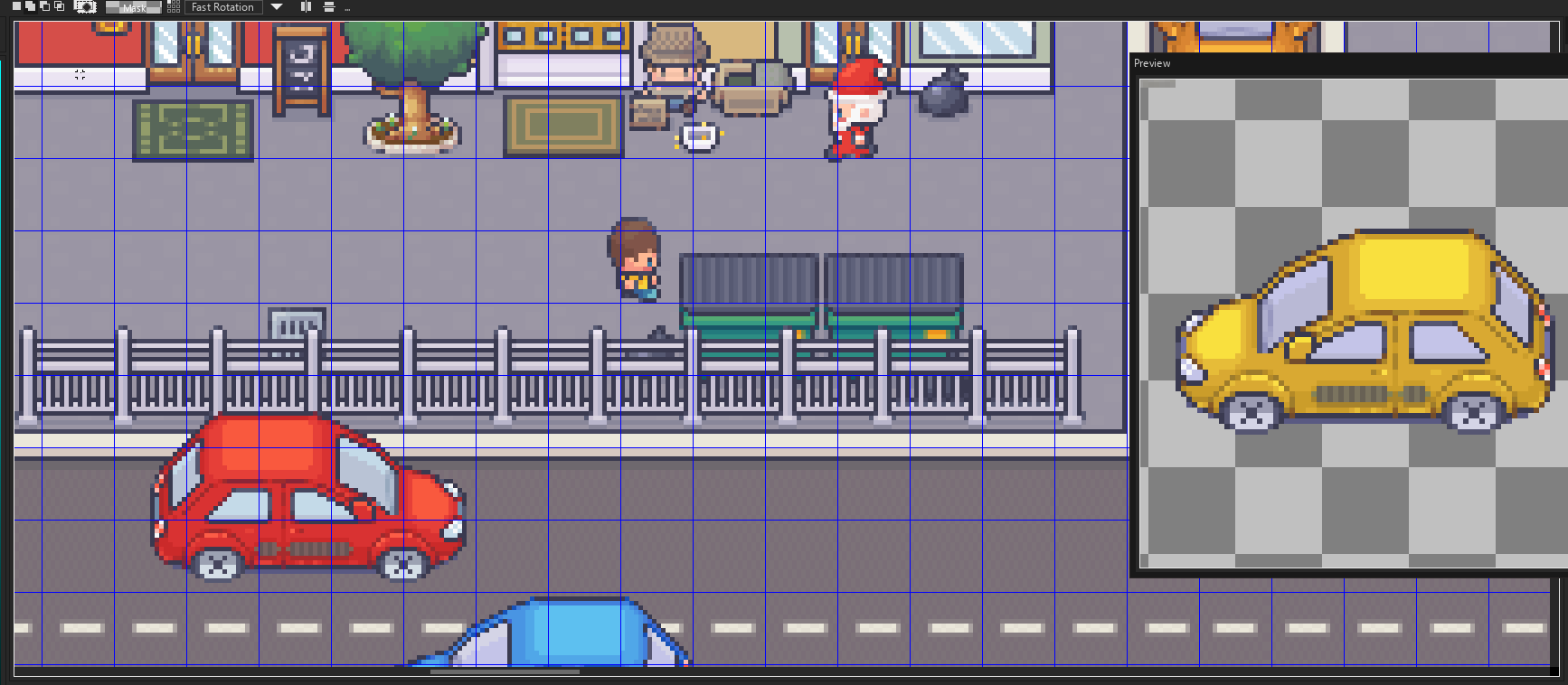
I know many of you are waiting for the city asset, and I'm sorry if it's not ready yet, but I want to give you something really unique that can be a starting point for another "frequently updated adventure" - I think that you all deserve a little spoiler at this point
Hi LimeZu, i’ve bought the modern interiors bundle and i’m wondering if you know any software that can change the colours of the tiles because i’m using GBstudio which only uses 4 colors for it to have a retro feel and will take a while to paint over all the tiles.
Hi Ca11Z, I’m sorry but I don’t know any software that could reduce the color palette that much without giving out a messy result! Btw, what palette are you using for the conversion?
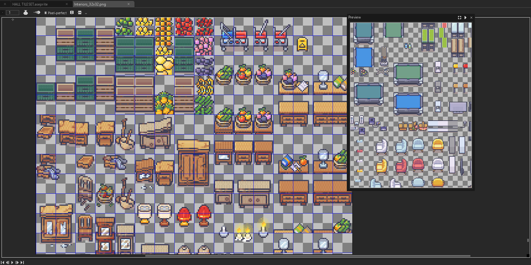
Hey there seems to be a problem with 1_Interiors > 32x32 > Interiors_32x32 file. It's just too blurry. I have set the filter mode to Point (no filter) and compression to none (in Unity). Please look into it
Hi Death Venom, that's a Unity setting issue, it might be the maximum sprite size, or something else affecting the pixel ratio. I ensure that file doesn't have render issues -
The issue is probably the fact that your texture size is set to 2048x2048, which means that it will be scaled down to 2048 if any dimension is bigger. The file you're using has probably 16000 pixels in one of the dimensions :P
Use the sorted files, and they might also be above 2048px, if so change the size of the texture to 4096px.
You'll find the setting in the inspector under the place where you set the filter type to point(no filter).
Hi zenaku, if you mean ready-to-use rooms with furnitures, there are none, but each of the .gifs you see beside is a simple placing of the stuff in the rooms, so it shouldn't be hard to achieve a nice look! The free version is incredibly gaunt tho - edit: now that you mentioned that, it may not be a bad idea to suppy pre-decorated rooms mmmm
I think I found the answer! I was wondering how you do the interior walls (white). I did not find it in the "wall" file but in the "other" file and "tilesets". Am I wrong?
You are not wrong! I wasn't really able to design that part for the MV cause its "Wall tileset" has extremely strict requirments, so I could just add the external wall patterns
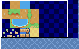
Hello! Your assets looks amazing and I'm thinking of purchasing, but I've got a question. Is it possible to import these assets in RPG Maker VX ACE? I've tried tinkering with the free assets to test, but importing the MX or XP assets doesn't work properly. I've added a screenshot to show what happens if I import the XP tileset:
Thanks in advance. Maybe I'm missing some knowledge here, since it's my first time trying different/custom tilesets, I'd love to be enlightened.
Hi space lion, The assets are not compatible with the VX ACE at the moment, that engine requires the tilesets to be exactly 512 x 512 px! I should be able to add them in the next few days if you wish :)
I thought so, but was getting worried I was just being stupid haha. If you could do that, it would be amazing. I love your sprites, they look so clean and simplistic, but very cute and perfect for rpg.
How long would it take your to convert this package?
I wasn't very specific, I wanted to do it with no wall, with a curve and no unnecessary line cuts:
But since it's just straight lines I managed to draw it myself, more or less. I have also drawn myself second version which has additional line separating bottom-going wall, like on the version you've made.
← Return to asset pack
Comments
Log in with itch.io to leave a comment.
Hi, great work!, u've lot of talent.
Just one question. It is possible to purchase for a license witch include commercial purposes, like a game?
Hi aduque! Sure, just paying at least 1.20$ grants you that type of license :)
um can i have your discord to talk to u?
What's the matter Noeff?
Oh sorry i solved it its ok now sorry! :)
Hey man! Working hard on updates, as I'm working hard on edits, lol.
Have you already made a character with twintails or have I missed it somewhere in the humongous size of this pack?
ahahah no there's no twintails character yet! I'm shifting all the character requests a bit cause I plan to introduce a system to create any characters by summing the various png having one body part/trait each
Oooh, like a character generator~
Seems nice, for those who aren't used to edits. Keep up the good work!
Great to see a consistent stream of updates here. I've used this pack before and now used it again for another game jam game, Haunted Rooms. It's worked well for me and I would recommend it.
Just played it and it was a lot of fun! The concept is great! Would love to see a wider version of it, it could be a mobile hit imho!
If I buy the winter bundle do I get the Modern_Interiors_v22.2 version that costs $1.20?
Yes, that's what I got. And you get all future updates ;)
Ok Cool buying now
It looks like I should hire Areinu as a secretary ahahah perfect answer, thanks ;)
Receptionist Colors
There appears to be a small problem with the colors on the purple receptionist.
Also, on the last two frames, her arm is missing. Or, if that's on purpose, the outline of the keyboard is missing.
Thanks for reporting it to me, I've just fixed it :) One was an old sprite left by mistake, and I fixed the missing outline problem!
Hi, how can i use it in godot tiledmap and draw wall by autotile function?
I'm not sure this asset is suitable for autotile function. That function is mostly used when walls are made from a single part. In this style wall is made from 2 tiles. There might be a way to do it but I would just do it by hand
These assets are amazing thank you for the great work! I am using these for a therapeutic game for children, mostly from impacted communities. It would be great to have more character sprites representing a wider range of ethnic minorities and backgrounds, so our kids can feel more represented :)
Hi, that sounds like an amazing project!
For the kid characters, would it be ok for them to only have the idle and run animations for your purpose? That way I could draw way more of them!
That would be awesome! We actually only use the idle and run animations so that works out perfectly. Thank you so much for your work, it's having a really big impact on these communities. In case you want to check out the project: https://www.therapysandtray.com/
Ok, I wasn't expecting such a cool and perfectly working application...I'm blown away by the idea. I'm really intrigued by it!
If you need any specific items you would like to have, please write a list and I'll try to add them as soon as possible!
Thanks for the compliment!
I will definitely let you know if anything specific comes up. So far, popular requests have been:
- More diverse characters (hispanic, black, asian, non-binary genders, lgbtq etc...)
- Family related characters (baby, mom & dad, grandparents...)
- Vehicles (car, bus, plane, ambulance, truck etc... )
- Hospital-themed objects
Thank you for being so generous with your help!
Got the list, thanks!
I've just added 3 new kid characters with some traits that were missing in the asset here
You've got a bug with new characters, rainbow shirt person and spiky head person are flipped. If you put them on the map they'll appear as themselves, but when you drag them anywhere they'll transform into other one. It's pretty funny :P
I still think the idea of "dress up" might make things so much easier for you. Something similar to this.
You are right Munch, I'll use the same method of your link!
Awesome! Custom LimeZu Characters!
Smaller files work better!
Instead of having one Room_Builder_16x16.png that contains a lot of different things, splitting it up into a number of smaller files would be much easier to work with as a developer, especially when there are frequent updates.
So you could have a Room_Builder folder and that could contain:
Great idea! This would be helpful not only for updating the assets but also creating smaller tile palettes. I did a separate file only with shadows and it was much easier to work with
Agreed, when I update room builder in unity it takes it 30 minutes to process the file.
Also, having it split into different files will mean that there's no need to reorder stuff around when new type of things or new row of things gets added, so it's more future proof. I already had to redraw my walls when new wall types got added and shadows moved.
And if someone really wants whey can make single palette for room builder things... in Unity they can anyway.
As a side note: would be great to not move the tiles around in the tilesheet if possible, it makes updating them easier :D
Thanks for your precious feedback guys, I've just updated the asset adding a subfile for each section of the "Room_Builder", as you asked! Also, I'll pay attention not moving around the stuff that's already placed! ;)
Thank you very much :)
Thank you :)
Thanks LimeZu! :)
You are welcome guys ;)
Made a new devlog :D I don't talk about your art much in this one but the trees are just part of the game now
Just watched it all! The editing is so funny and pinterest is indeed a great site to take inspiration from, I also used it when I started pixel art!
Your YouTube videos are *great*--really watchable, engaging & authentic.
I found your channel via channel list on PlayWithFurcifer's channel.
Do you have an account on Twitter? (You already got a mention from a Godot dev team member: https://twitter.com/Akien/status/1372498829115801602)
woah, thanks for letting me know about that!!!!! awesome to get that shoutout and I appreciate the feedback!
Are you dropping a new video soon? We are all waiting for it!
omg thats so nice :') working on one now!!
This is fantastic, I'm looking for an asset for my gather.town space, which is meant to be a lockdown substitute for the house parties that I threw in happier times, and preliminarily I'm thinking that this is gonna be the asset pack that we go with, but either way it's so phenomenal I just had to have it, and wanted to leave some appreciation for the talent and dedication of the artist! 😍
Gosh, I wish that gather.town had support for animated sprites...
Thank you so much for the support and the kind words Poly :) Maybe in the future they are gonna add them!
Good day.
I absolutely love the pack. I also like the color palatte.
Just a random question. Does anyone know how you implement this on Godot? At the moment I'm considering placing individually but that seems inefficient
Thank you so much!
Unfortunately I know nothing about Godot, hopefully someone will help you soon :)
Maybe this will help you: https://docs.godotengine.org/en/stable/tutorials/2d/using_tilemaps.html
I have some walls going in wrong directions with autotiles. I'll read the docs thoroughly and retry again and see what happens. Thanks!
could you show me how to use this asset to draw wall with godot's autotiles? maybe a youtube vdieo, or blog article? thanks!
I would suggest using it by hand. No real way to use the autotiles in godot. Sorry
Absolutely awesome pack! Just seeing these assets made me shift from what I was doing to these graphics. I happily bought them! Plan to be making a school game~~ let's see how it turns out!
Hey Owl, thanks for supporting ;)
Since you mentioned it, I announce you that the next theme gonna be the college/university!
Wonderful! Seifuku uniforms on their way, then!
Just out of curiosity, how many sets approximately do you work on every day?
Modern interiors in the morning and it drains most of my energies. In the late evening/night I work on commissions and a bit on the exterior pack!
One thing that I did for myself, that I thought would be cool "official" addition. I've separated the shadows dropped by the walls into separate 4 tiles, that have a bit of alpha transparency for shadow part, and are otherwise transparent. Now I can draw all my rooms with using only 1 tile for the floors when prototyping and it makes it easy to update them, and when I'm done I just add the shadows on the separate layer as needed.
With this approach I can even have walls drop shadow on some items where it makes sense, for example I can have shadow over this carpet.
You could add it to room builder above all the floors. I've seen that done in some other tileset and it's really cool! And if I now want to replace all the floors in a room I can just use fill tool, and I keep all the shadows.
Hi Areinu!
That was such a cool idea that I've already added it to the asset! here
Thanks for the advice ;)
Very cool! And you even went extra mile to include different thickness. But one question remain. Why did you skip the side shadows?
BTW: Love new room/floor connections!
Why did I skip the side shadows you ask me? Cause I forgot them...gonna fix it now gosh
edit: done!
I'm just amazed with your reaction speeds D:
ahahahah I do my best!
I'm scared to ask this :D Did you include full tile shadow?
...nope. But now yes eheheh
Wonderful work!
One suggestion for a future pack (or also a separate pack): characters elements to create a custom character.
I.e. an extension of the existing template (for different skin tones) plus separate sprites for hair, eyes, glasses, clothes, accessories, etc.
This would allow to create an almost infinite number of character and add customization option to the game (e.g., for the player's character)
Thank you for your great work!
Hi alapalaya, I totally forgot to answer you, I'm sorry!
That's a good idea, I was already planning to add a "dress up" system in this pack, so thanks for your prompt! :)
that's great, looking forward to it.
And thank you for the great work and for being so attentive to the users' feedback!
You are welcome ala ;)
I would love to see a "dress up" system!
Hi, I really love your set, thank you so much for making it! I am learning how to make games, and I confused myself lol. The sets at the bottom of the room builder file, are they bitmaps?
Hi ash, thanks for your comment! The tiles at the bottom of the Room_Builder are some paths you can use with the matching above floors :)
Thank you! I had trouble understanding.
Don't worry, ask again if you need help :)
Hi, love your work. Do you ented to do modern external tilesets in the future?
Yes marcus, it's in the making :)
thats very nice to hear :)
Hi LimeZu
you have very nice tileset so I purchased it. Now I am trying to use it in the unreal 2d paper but I have problem with this grey border around almost every wall. Have any advise how to get rid of it?
Im using 32x 32 version.
Thank you.
Hi hajjki, you would like to have a version of the walls without the blue border?
Waw I did not expected answer during Friday's night. :)
But it was my misunderstanding, I am still learning and I did not understand it correctly first how it works. Now I see I can use it as inner corner :)
Alright, tell me if you have any other doubt ;)
love your pack so much had to comment highly reccomend
Thank you so much pakaju! :)
LimeZu could you share how you make gifs for daily updates?
I make them using Aseprite, is there something specific you would like to know?
Thank for the answer. Mainly I was wondering how you add gifs to a static image but I will read about Aseprite
Uh, ok! You had frames for the animations and then export the whole file as a .gif!
For the animated doors:
So if a door has no shadow at first, but then plays its locked animation, it ends up with a shadow!
For consistency, please can you standardise this to either shadow or no shadow across all door animations?
Ahhh I got it after checking for minutes x)
The black shadow of the "locked" animation is supposed to give a shakier effect to the whole thing, but indeed ending with that shadow is not nice.
I'm adding a duplicate of the first frame at the end, so when the animation is over the door will be fine and without any weird shadow! I made those doors so many months ago that I didn't even remember ahaha
That works, thank you so much!
You are welcome! ;)
Hi rossifer,
this issue happens cause I have frequently sorted all the stufff by hand, and bigger the size more probable is the mistake. Anyways it's a really fast fix that's required.
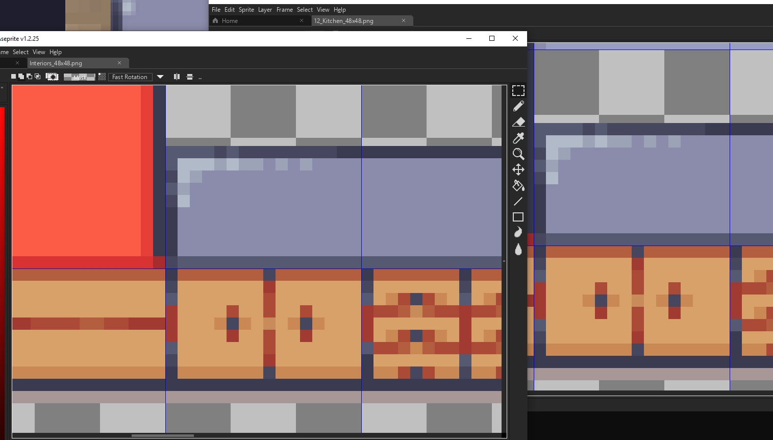
For your case, I can't find the misplacement, both the "Interiors_48x48" and the "12_Kitchen_48x48" looks fine to me! May it be your game engine settings? Cause I see a blurred outline meaning the pixels are getting a bit squeezed!
You are correct--this was my mistake due to my Unity settings. Thanks for the quick response, LimeZu!
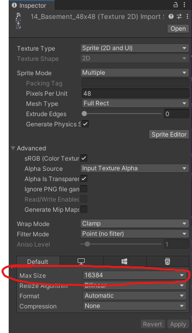
For anyone experiencing the same issue, I increased the Max Size in the tile set inspector to the max value (16384) to fix it.
You are welcome rossifer, and thanks for the little tutorial ;)
This solved my issue, thanks
Great! Check this video if encouter any other optimization issue, it might help! ;)
Hello again brother, this morning I bought the original package as I had already told you and it is simply incredible. But I have a question, I am using a tool called "Tiled" and I export the tileds to unity. My question is about which sprites I have to work with directly, with the ones in the "Interiors" folder or should I use the RPG maker ones? Thank you so much again wonderful
Hi Ivan! I suggest you to use the sorted files you can find in the "Theme_Sorter" folder, or the global file called "interiors_16x16" :)
Can you do a lab and hospital. Also are you ever going to do an exterior set?
The exterior set is in the making and yes, there's going to be an hospital theme in the pack, a lab too maybe (I'm adding it to the long list)
here's another devlog using your art :)
Great devlog as always! Looking forward to the next one! :)
thank you!!
I saw your posted video in the comment section and I really appreciated it! Instant subscribed!
yay thanks!! Means a lot!
Water! Thank you!
Hey! This looks like a wonderful asset pack and a much better tile map that what I would come up with myself.
I’m considering purchasing this tileset in addition to the office extension, but I have a couple of questions regarding the paid licensing.
Thanks in advance.
Hi Marquis, I'm happy you are considering to choose my assets!
Awesome, thanks for the quick response! I’ll be sure to make a smaller set with only the assets I use in my projects.
You are welcome Marquis, happy game-developing :)
Hello! To start thanks for creating such a amazing asset pack, though I'm having several issues with tiles lining up properly/looking proper in RPG Maker MZ. Not everything does it but a few do.
Most notably so far is the custom kitchen sink tiles.
I'm not really sure how to get it to look right, I've tried quite a few things including which layer I put them on. Any help is appreciated ^^.
Hi mitchs, some of the stuff might not look to right in the RPG Maker versions cause the whole asset is not designed to only have 3 layers. If you find some really weird stuff, please let me know and I'll try to bypass the layer limitation!
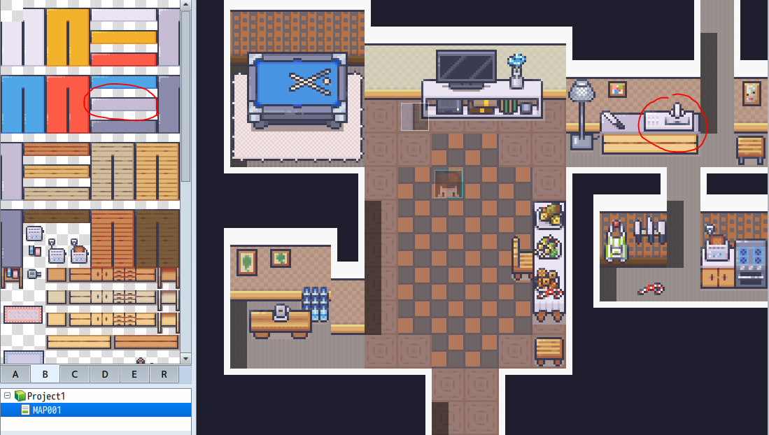
For the kitchen stuff, many of them need to be placed on a kitchen shelf, there are several to choose from :)
Oooh. I see. Thanks for the quick response! I'll definitely let you know if I come across anything too odd.
Hey, I bought this yesterday and I really enjoy working with it!
Please would you consider adding the following?
I understand that you have some of these elements already, but it would be fantastic if you could build them out into dedicated themes / rooms, please.
Hi GameDev, your ideas are really cool! I'm writing down them all :)
Glad you like them, thank you so much!
You are welcome! :)
Hello! I just noticed that the carpets seem to be off by one pixel, at least in the 48x48 variant. Cf here:
Also one question: is there something that would help hide hard transitions between two types of floors? kind of drip deflector, to make the floor change less jarring.
Hi arcanin
I fixed that carpet today, thanks for reporting it to me :)
The only way to hide the floor transitions, at the moment, is using a carpet, but I'm thinking of a proper method for that cause it would be useful indeed
Just bought this and I am trying to recreate the Receptionist Scene (your very first example at the top-right).
I am using the tiles from Interiors_16x16.png, but I am struggling to get it to look like your example, while adhering to a 16x16 tile grid.
It looks like you deviated from that grid with either the stairs or the desk? You somehow tweaked the red carpet, which normally is longer, and I just can't figure out how to recreate the border around the edges of the elevator doors?
I am referring to the elevator that is shown on the left in this post:
https://limezu.itch.io/moderninteriors/devlog/172870/12th-update-elevators
Hi GameDevMix,
- To get my same placing of the stairs and the desk you have to overlap the border tile of the desk on a different layer
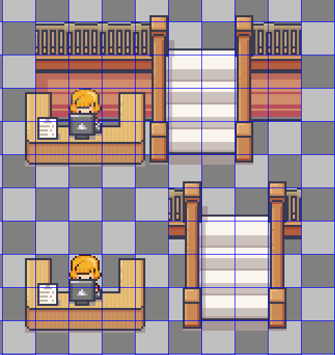
- The red carpet was indeed missing that corner tiles, I added them to it and the others with today's update, in the new "Room_Builder" file! here
- All the elevator stuff got revamped some weeks ago (here) and that border was removed due to animation issues. I added it back to the files so you can still use it even if it doesn't have a related animation!
.
Comment again if you encounter any other issue, I'll solve it asap :)
Thank you so much!
There is an exterior version of this?
Hi Holy, not yet, it's in the making :)
Probably the most detailed tileset on whole itch.io website. Especially when RPG assets are mostly made for medieval or fantasy worlds this one is unique. And lime_zu takes the label "daily updated" literally. He really keeps updating this everyday. Weekdays, weekends, public holidays.
Thanks for your review aliustaoglu, I really appreciate your kind feedback :)
Hi Limezu, :D
I want to buy this packet complete, but i need some sprites about city or streets or exteriors , cars, builds, parks , neighborhood.
Is it possible that an exterior can be designed in
this package? Or have you other package to make that.
I'll wait for your answer, thank you so much
Hi ivan, I'm working on a city asset, its creation is taking a lot of time cause I'm trying to add things that haven't been seen on itch yet, so stay tuned ;)
I'm in queue to buy that when it releases :P
I know many of you are waiting for the city asset, and I'm sorry if it's not ready yet, but I want to give you something really unique that can be a starting point for another "frequently updated adventure"
-
I think that you all deserve a little spoiler at this point
Thank you very much I will be on the lookout. :)
Probably after this you'll see thousands of indie games made with your tilesets. Big competition but I'll try to make the best one :))
eheheh I'm looking forward ali! :)
Wow, thanks for this sneak peek. I am super excited and will be the first to buy your new asset.
I am also in queue to buy it!
Hi LimeZu, i’ve bought the modern interiors bundle and i’m wondering if you know any software that can change the colours of the tiles because i’m using GBstudio which only uses 4 colors for it to have a retro feel and will take a while to paint over all the tiles.
Hi Ca11Z, I’m sorry but I don’t know any software that could reduce the color palette that much without giving out a messy result! Btw, what palette are you using for the conversion?
Hi LimeZu
For sprites i’m using the standard ones which are #071821 #86c06c #e0f8cf and #65ff00
#071821 #306850 #86c06c and #e0f8cf are for the tiles.
It’ll just take a long time to paint over all the assets which is why i bought your assets to save lots of time that i don’t have.
Hi Death Venom, that's a Unity setting issue, it might be the maximum sprite size, or something else affecting the pixel ratio.
I ensure that file doesn't have render issues
-
The issue is probably the fact that your texture size is set to 2048x2048, which means that it will be scaled down to 2048 if any dimension is bigger. The file you're using has probably 16000 pixels in one of the dimensions :P
Use the sorted files, and they might also be above 2048px, if so change the size of the texture to 4096px.
You'll find the setting in the inspector under the place where you set the filter type to point(no filter).
Thanks for your technical help Areinu, really helpful! :)
Thanks I'll check it again asap!
Does the licensed version contain ready made interiors to use in unity?
I downloaded the free one and I can't get how you put them all together to look nice and kinda got lost in there. Do you have any tips?
Hi zenaku,
if you mean ready-to-use rooms with furnitures, there are none, but each of the .gifs you see beside is a simple placing of the stuff in the rooms, so it shouldn't be hard to achieve a nice look! The free version is incredibly gaunt tho
-
edit: now that you mentioned that, it may not be a bad idea to suppy pre-decorated rooms mmmm
Thank you for the fast reply!
I will give it a try with the full version.
Hope you'll consider adding ready to use rooms. 🙂
Still loving your sprites! Fyi I'm making a devlog of my game that uses these sprites for prototyping my game:
I just watched the devlog, it was really nicely done! Thanks for choosing my assets, feel free to post any of your videos here, it's not a bother ;)
thanks! will do!
Well done! Did you find the water on itch, or did you make it yourself?
thanks! I made it- im going to post a video about the water tiles today or tmrw
Thank you, just watched the video. Great explanation!
Hello LimeZu,
Do you have a streaming channel where we can see you using your tileset ? I am still struggling to use it to its full potential... :(
Hi Thomas! No streaming channel yet, I'm sorry! Is there anything can could be solved with a comment?
I think I found the answer! I was wondering how you do the interior walls (white). I did not find it in the "wall" file but in the "other" file and "tilesets". Am I wrong?
You are not wrong! I wasn't really able to design that part for the MV cause its "Wall tileset" has extremely strict requirments, so I could just add the external wall patterns
Perfect!! I am all set!! Be sure I will buy the city tileset!
Hello! Your assets looks amazing and I'm thinking of purchasing, but I've got a question. Is it possible to import these assets in RPG Maker VX ACE? I've tried tinkering with the free assets to test, but importing the MX or XP assets doesn't work properly. I've added a screenshot to show what happens if I import the XP tileset:
Thanks in advance. Maybe I'm missing some knowledge here, since it's my first time trying different/custom tilesets, I'd love to be enlightened.
Hi space lion,
The assets are not compatible with the VX ACE at the moment, that engine requires the tilesets to be exactly 512 x 512 px! I should be able to add them in the next few days if you wish :)
hi LimeZu,
I thought so, but was getting worried I was just being stupid haha. If you could do that, it would be amazing. I love your sprites, they look so clean and simplistic, but very cute and perfect for rpg.
How long would it take your to convert this package?
I'm rushing it , it's a pretty long process tho, I hope to end it for today's update!
I've just added the VX Ace compatibility for the full version of this asset here
I'm gonna update Serene Village too this evening or tomorrow :)
Wow, was not expecting it this fast! Great work, will check it in the evening :)
Hi!
I've used your pack in my latest project, and it is amazing!
If you want to, you can check it out here: https://aresprojects.itch.io/clinn
Keep up the good work!
Hi aRe! Thanks for using my asset!
Keep going, I would love to see your idea on a wider project! :)I loved the managment aspect of the game!
Also, I have subscribed to your channel after watching the video:
Thank you! :D
Call me blind, but I've spent hour looking for the ceiling-turn tile like in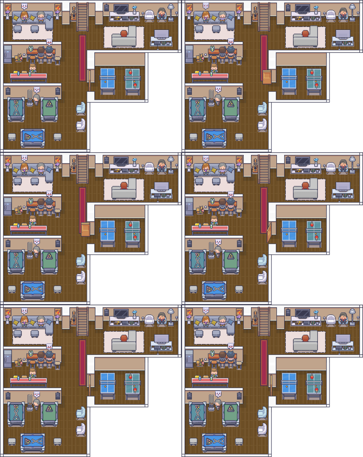
under the animated door. Any suggestion where to look for it in 48x48 version?
Hi Areinu, that's a sum of 2 tiles!
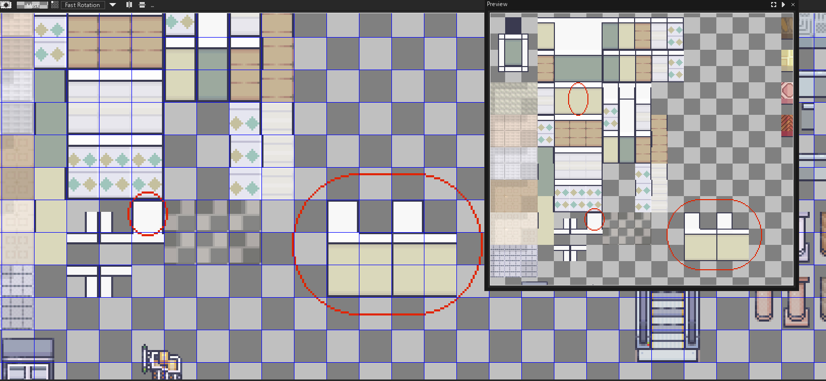
Hope it helps, comment again if you need ;)
I wasn't very specific, I wanted to do it with no wall, with a curve and no unnecessary line cuts: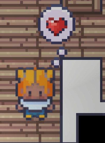
But since it's just straight lines I managed to draw it myself, more or less. I have also drawn myself second version which has additional line separating bottom-going wall, like on the version you've made.
Ah you right, I’m sorry. I just had a little time to answer you and I missed it